|
|
Post by Kari Muffin on Nov 28, 2007 20:38:09 GMT -5
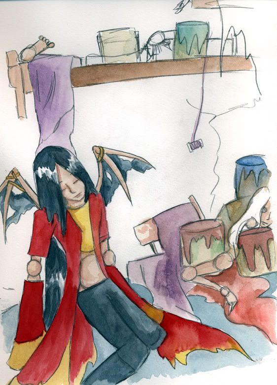
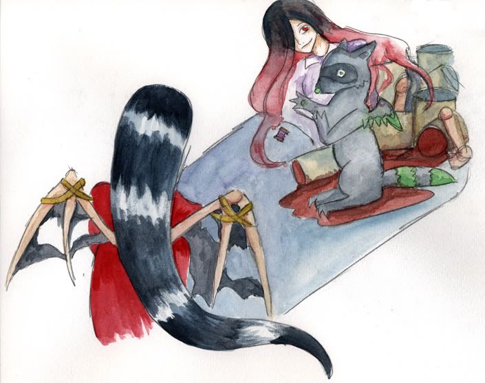
Oh lookit. Time to do the actual project. Go me killing myself. Here are the flat water colors for two of the panels.  Still need to do the walls.  |
|
|
|
Post by seraaches on Nov 28, 2007 21:36:17 GMT -5
KAWAII! *stares*
|
|
|
|
Post by Kasatsu on Nov 29, 2007 1:37:39 GMT -5
<33333
I love the coloring * ____ *
|
|
|
|
Post by Kari Muffin on Nov 29, 2007 12:00:53 GMT -5
^_^ Thank you! XD I really should do watercolors more often.
|
|
|
|
Post by Kasatsu on Nov 29, 2007 17:52:14 GMT -5
You should!
*pushes you gently to do more watercolors* <333
|
|
|
|
Post by Kari Muffin on Dec 7, 2007 21:00:51 GMT -5
*ahems* bumpity. <3 go to the first post to see the finished product of four weeks of illustration work ruined by my scanner.
|
|
|
|
Post by Kasatsu on Dec 7, 2007 21:04:23 GMT -5
LO~VE <33333333
|
|
|
|
Post by seraaches on Dec 7, 2007 21:16:02 GMT -5
Ooohhh!!! i LOVE how the house came out!!!!! *_* The roof made me stare!!! <33 Those are wonderful, Kari dear!!!!
|
|
|
|
Post by Satra on Dec 9, 2007 13:43:44 GMT -5
I love the effect of the mixed media, especially in the house! The way you just used the wash to indicate the background on the sky and the textures and the subtly of the different colors in the house itself. Very lovely!
If I may offer some critique? The perspective... something looks off on the middle picture. Like there's no definition between the wall and the floor. P:
I'm still loving that house, though. <3
|
|
|
|
Post by Kari Muffin on Dec 9, 2007 14:30:21 GMT -5
Thank you <3  ; oh crap. You're right. You really notice it a lot more in the scans than the actual picture. I don't know how I am going to fix it... >_>; but it probably happened when I moved the character. *shifty look* Let's see what I can do before critique tomorrow. |
|